久しぶりの更新ですがな。
今回はbox-shadowでよく使うものをメモっておこうと思います。
ググれば似たようなものがたくさん出てきますけど、オレルールでプロパティを整理してメモっとこってお話です。
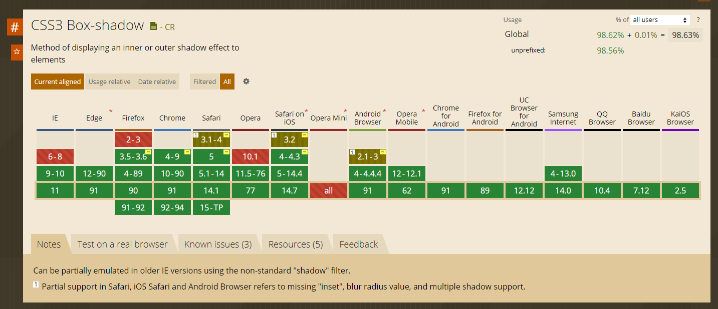
まずはbox-shadowのブラウザ対応はどうなってるかを見てみましょう。
はい。IE9位上ですね。はい。
では早速。
下に四角でサイズちょっと小さめ

htmlは共通なんですけど一応
html
<div class="shadow01">
	<p>shadow01</p>
</div>
SASS
.shadow01 {
    @include box-shadow(0 10px 6px -6px #888);
}
CSS
.shadow01 {
  -moz-box-shadow: 0 10px 6px -6px #888;
  -webkit-box-shadow: 0 10px 6px -6px #888;
  box-shadow: 0 10px 6px -6px #888;
}
下の角が両方ともめくれた感じ

html
<div class="shadow02">
	<p>shadow02</p>
</div>
SASS
@mixin shadow02 {
    position: absolute;
    content: "";
    top: 80%;
    bottom: 15px;
    left: 10px;
    width: 50%;
    @include box-shadow(0 15px 10px #888);
    @include transform(rotate(-3deg));
    z-index: -1;
}
.shadow02 {
    position: relative;
    &:before {
        @include shadow02;
    }
    &:after {
        @include shadow02;
        @include transform(rotate(3deg));
        left: auto;
        right: 10px;
    }
}
@mixinを使ってますん。
CSS
.shadow02 {
  position: relative;
}
.shadow02:before {
  position: absolute;
  content: "";
  top: 80%;
  bottom: 15px;
  left: 10px;
  width: 50%;
  -moz-box-shadow: 0 15px 10px #888;
  -webkit-box-shadow: 0 15px 10px #888;
  box-shadow: 0 15px 10px #888;
  -moz-transform: rotate(-3deg);
  -ms-transform: rotate(-3deg);
  -webkit-transform: rotate(-3deg);
  transform: rotate(-3deg);
  z-index: -1;
}
.shadow02:after {
  position: absolute;
  content: "";
  top: 80%;
  bottom: 15px;
  left: 10px;
  width: 50%;
  -moz-box-shadow: 0 15px 10px #888;
  -webkit-box-shadow: 0 15px 10px #888;
  box-shadow: 0 15px 10px #888;
  -moz-transform: rotate(-3deg);
  -ms-transform: rotate(-3deg);
  -webkit-transform: rotate(-3deg);
  transform: rotate(-3deg);
  z-index: -1;
  -moz-transform: rotate(3deg);
  -ms-transform: rotate(3deg);
  -webkit-transform: rotate(3deg);
  transform: rotate(3deg);
  left: auto;
  right: 10px;
}
ゲロ長いけどコピペでいけるはずですん。
右下がめくれた感じ

html
<div class="shadow03">
	<p>shadow03</p>
</div>
SASS
.shadow03 {
    position: relative;
    &:before {
        position: absolute;
        content: "";
        top: 80%;
        bottom: 15px;
        left: 10px;
        width: 50%;
        @include box-shadow(0 15px 10px #888);
        @include transform(rotate(-3deg));
        z-index: -1;
    }
}
CSS
.shadow03 {
  position: relative;
}
.shadow03:before {
  position: absolute;
  content: "";
  top: 80%;
  bottom: 15px;
  left: 10px;
  width: 50%;
  -moz-box-shadow: 0 15px 10px #888;
  -webkit-box-shadow: 0 15px 10px #888;
  box-shadow: 0 15px 10px #888;
  -moz-transform: rotate(-3deg);
  -ms-transform: rotate(-3deg);
  -webkit-transform: rotate(-3deg);
  transform: rotate(-3deg);
  z-index: -1;
}
右下がめくれた感じ

html
<div class="shadow04">
	<p>shadow04</p>
</div>
SASS
.shadow04 {
    position: relative;
    &:after {
        position: absolute;
        content: "";
        top: 80%;
        right: 10px;
        bottom: 15px;
        left: auto;
        width: 50%;
        @include box-shadow(0 15px 10px #888);
        @include transform(rotate(3deg));
        z-index: -1;
    }
}
CSS
.shadow04 {
  position: relative;
}
.shadow04:after {
  position: absolute;
  content: "";
  top: 80%;
  right: 10px;
  bottom: 15px;
  left: auto;
  width: 50%;
  -moz-box-shadow: 0 15px 10px #888;
  -webkit-box-shadow: 0 15px 10px #888;
  box-shadow: 0 15px 10px #888;
  -moz-transform: rotate(3deg);
  -ms-transform: rotate(3deg);
  -webkit-transform: rotate(3deg);
  transform: rotate(3deg);
  z-index: -1;
}
真下にまるっこい影

html
<div class="shadow05">
	<p>shadow05</p>
</div>
SASS
@mixin shadow05 {
    position: absolute;
    content: "";
    top: 50%;
    right: 10px;
    bottom: 0;
    left: 10px;
    @include border-radius(100px 100px 100px 100px/10px 10px 10px 10px);
    @include box-shadow(0 0 20px #888);
    z-index: -1;
}
.shadow05 {
    position: relative;
    &:before {
        @include shadow05;
    }
    &:after {
        @include shadow05;
        @include transform(skew(8deg) rotate(3deg));
        left: auto;
        right: 10px;
    }
}
@mixin使ってますん。
CSS
.shadow05 {
  position: relative;
}
.shadow05:before {
  position: absolute;
  content: "";
  top: 50%;
  right: 10px;
  bottom: 0;
  left: 10px;
  -moz-border-radius: 100px 100px 100px 100px/10px 10px 10px 10px;
  -webkit-border-radius: 100px;
  border-radius: 100px 100px 100px 100px/10px 10px 10px 10px;
  -moz-box-shadow: 0 0 20px #888;
  -webkit-box-shadow: 0 0 20px #888;
  box-shadow: 0 0 20px #888;
  z-index: -1;
}
.shadow05:after {
  position: absolute;
  content: "";
  top: 50%;
  right: 10px;
  bottom: 0;
  left: 10px;
  -moz-border-radius: 100px 100px 100px 100px/10px 10px 10px 10px;
  -webkit-border-radius: 100px;
  border-radius: 100px 100px 100px 100px/10px 10px 10px 10px;
  -moz-box-shadow: 0 0 20px #888;
  -webkit-box-shadow: 0 0 20px #888;
  box-shadow: 0 0 20px #888;
  z-index: -1;
  -moz-transform: skew(8deg) rotate(3deg);
  -ms-transform: skew(8deg) rotate(3deg);
  -webkit-transform: skew(8deg) rotate(3deg);
  transform: skew(8deg) rotate(3deg);
  left: auto;
  right: 10px;
}
これもゲロ長いけどコピペね。
まとめ
ボクがよく使うのはこの5つです。ウソです。5つ目はあまり使わないです。てか使ったことないです。ごめんなさい。
とりあえずメモなので、どれもコピペで使えるはずです。
それはそうと、明日は市内に用事を作って直帰しまーすのノリでレイトショー行きたいんだけどどうでしょー。
恐竜がガブガブするやつ見たいのよね。←ジュラシックワールド